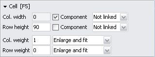
 Cell parameters
Column width and row height
Column weight and row weight
Column weight usage and row weight usage
Size modes
You can apply cell parameters to a single selected cell or to any combination of selected cells.
|
| Cell parameter panel |
Column width and row height Top of page
A design grid's columns can be of different width and rows can be of different height. In the following discussion we focus on column width, row height works just the same.
You can define column width either as absolute value (in pixels), component-relative value (exactly the component's preferred width) or as column-relative value (same width as column xxx).
| Absolute value: The column is guaranteed to be at least as wide as the defined value. If a component in that column has a preferred width greater than the specified width, the component's preferred width will be respected. Most often you will set an absolute value for empty rows/columns. |
| |
| Absolute column width Example 02 | |
|
|
Component-relative value: The column is guaranteed to be as wide as the component's preferred width. A component-relative value is specified by setting |
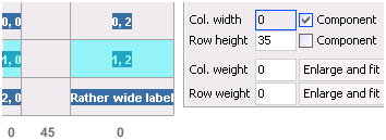
| |
| Component-relative column width Example 03 | |
|
|
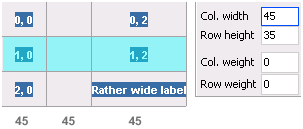
Column-relative value: Two (or more) columns will be of the same width and this will be the width of the widest column involved. If the involved columns have different weights (see next section) they will be of the same width only if there is no need to expand for either of the columns. (In the example below the left and right anchors of the 'OK' button are set so it fills its cell horizontally.) |
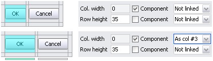
| |
| Column-relative column width Example 04 |
| With at least one cell selected, change cell width with W+Value, (where Value must be an integer). To change cell height, enter H+Value. To change values relative to the current value, precede Value with 'plus' (+) or 'minus' (-). |
Column weight and row weight Top of page
Weights come into play if the design grid is inside a container (e.g. a
JTabbedPane or the ContentPane of a JFrame) and the design grid's size is smaller than the container's size.
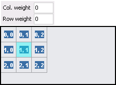
|
| In Example 05 A you see the situation with no weights defined. |
|
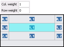
| As you set Col. weight to a value > 0, the selected column stretches to fill the container horizontally (Example 05 B). |
|
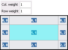
| As you set Row weight to a value > 0, the selected row additionally stretches to fill the container vertically (Example 05 C). |
|
|
| ||
| Example 05 A | Example 05 B | Example 05 C |
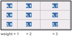
Weight values are proportional. If more than one column/row has a weight > 0, the free space is divided proportionally among weighted columns/rows.
|
| Example 05 D |
|
| With at least one cell selected, change column weight with C+W+Value, (where Value must be an integer). To change row weight, enter R+W+Value. To change values relative to the current value, precede Value with 'plus' (+) or 'minus' (-). |
Tip: Pressing <Q> visualizes the cell weights of the currently displayed container, pressing <Q> again shows cell weights of sub-containers. Clicking in the editor clears the display.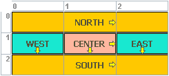
|
Column weight usage and row weight usage Top of page
There are three weight usage modes: Enlarge and fit, Enlarge only, Fit multicolumns/multirows only.
To understand the difference between these modes, study the following examples:
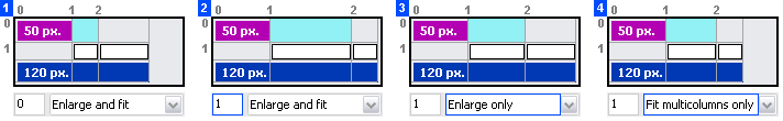
|
| Example 06 A-D Column weight usage |
First notice that every layout looks slightly different. Here comes the explanation:
| On the left you see the layout with no weights set. The first cell is as wide as the upper component's preferred width, the next cell is 24 pixels wide (its absolute size), the third cell's width is calculated from the lower component's preferred width minus first-cell-width minus second-cell-width. |
|
Column weight of column #1 is set to 1. With Enlarge and fit, column #1 is enlarged in two steps: first, to fit the preferred width of the lower component and, second, to fill the pseudo-frame horizontally, the last cell is 24 pixels wide (its absolute width). |
| With Enlarge only, column #1 is enlarged only to fill the pseudo-frame horizontally. The third cell's width is calculated from the lower component's width minus first-cell-width minus second-cell-width. |
| With Fit multicolumns only, column #1 is enlarged to fit the preferred width of the lower component but doesn't enlarge to fill the pseudo-frame (notice the difference to [1]). |
| Because differences are subtle, it may be hard to follow what happens. The Enlarge and fit mode, which is the default, should almost always suit your needs. |
Size modes Top of page
There are three size modes which affect the display size of a design grid:
 |
Minimum size: Is calculated from the minimum size of all components in the grid. |
 |
Preferred size: Is calculated from the preferred size of all components in the grid. This is also the size of a pack()'ed frame. |
 |
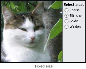
Fixed size: Draws a border around the design grid which you can adjust similar to a frame border (indeed this is to simulate a frame). At 'Grid | Fixed Size...' you can set the border size numerically. |
|
|
| ||
| Example 07 Size Modes |