 Containers in grid cells
Traversing the container hierarchy
JTabbedPane
JSplitPane
JScrollPane
JMenuBar
JToolBar
The purpose of a container is to hold other components. First we look at containers in general, then we discuss some special ones.
To add a component to a container, first insert the container in a grid cell and then drag the component to the same cell (if you reverse these two steps, then you apply the container to the component).
|
| |
| Add JList to JTabbedPane Ex 12 | Apply JScrollPane to ImageIcon Ex 13 |
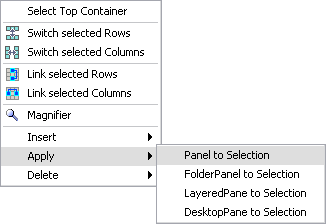
You can also convert a (contiguous) selection into a container (one of
JPanel, FolderPanel, JDesktopPane or JLayeredPane). You find the appropriate commands in the grid context menu.
|
JPanel or FolderPanel, the selection is replaced by a panel containing the selection (with JPanel you will see no difference). In case of JDesktopPane or JLayeredPane, the selection is added as the pane's content panel and is then replaced by the pane.
Traversing the container hierarchy Top of page
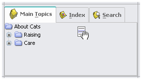
To select a component inside a container, maybe to adjust its properties, you can either double-click the container or you can select the desired component in the project view. In both cases you switch to the next hierarchy level.
|
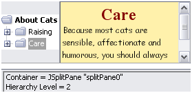
| |
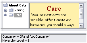
| JSplitPane with JTree and JScrollPane Ex 14 | Next hierarchy level: JTree | JScrollPane | |
| To return to the top hierarchy level, select 'Grid | To Top Container'. |
| To step up one hierarchy level, select 'Grid | To Parent Container'. |
| To switch back to the last displayed container, select 'Grid | To Last Displayed Container'. |
The Navigator window
You can easily traverse the container hierarchy using the Navigator (select 'Window | Navigator' or press
F9).The Navigator window displays an overview of the container hierarchy. As you move the mouse on a container icon, this container is marked in the layout. As you click the mouse, the container (respective its content) will be displayed.
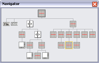
|
| |
| The Navigator | A marked container |
JTabbedPane Top of page
Whenever you add a component to a tabbed pane, a new tab is generated (showing the variable name of the component) and the component is made the selected component.
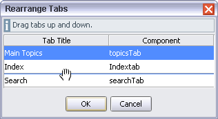
To select another tab, to remove a tab from the tabbed pane or to rearrange tabs, select the according menu item from the tabbed pane's context menu.
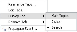
|
| |
| JTabbedPane's context menu | The 'Rearrange Tabs' dialog | |
JSplitPane Top of page
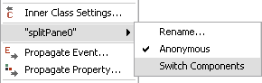
A JSplitPane can hold only two components. The first component you add is added as the top/left component, the second at the bottom/right position. If you try to add one more component, a dialog appears, where you can decide to add this component as the splitpane's top/left or bottom/right component (or not at all). The 'Switch Components' command from the splitpane's context menu switches both components.
|
| JSplitPane's context menu |
JScrollPane Top of page
JScrollPane requires some special care to work as expected.
You should know that a scrollpane's preferred size is calculated from the preferred size of its viewport component, respectively, if the viewport component implements
Scrollable, from its preferredScrollableViewportSize property.
 |
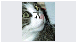
An image-label (examplary for all components which not implement Scrollable), has a preferred size equal to the image size. This means that, without any additional constraints, the scrollpane would always show the entire image (and therefore wouldn't be very useful). So you should set the preferredSize property of JScrollPane to a value smaller than the image size.(If you prefer a defined scrolling behaviour you can apply a JPanel to an image label, see the note below.)
|
Example 15 | |
|
A JList implements Scrollable and has a visibleRowCount property from which JList calculates its preferred height (whereas its preferred width is the width of the widest item in the list). As a consequence, JLists in scrollpanes work perfectly without any additional settings.
|

Example 15 | |
|
A JTree also implements Scrollable and has a visibleRowCount property (which defaults to 20 visible rows). Its preferred width is equal to the width of the widest (displayed) tree node, but might easily enlarge as you expand nodes. Therefore you should specify a cell width which is wide enough that nodes will have some place to expand and set the left and right anchors.
|
Example 15 | |
|
A JTable also implements Scrollable and, as the only component, has a preferredScrollableViewportSize property (which defaults to Dimension(450, 400)). The preferable way to specify the scrollpane's size is to set the table's preferredScrollableViewportSize property.
|
Example 15 | |
Note: With RADi, every JPanel implements Scrollable, the scrolling behaviour is defined by a ScrollableDefinition which you access via the scrollableDefinition property (see The Scrollable definition).
|
JMenuBar Top of page
Normally a
JMenuBar is added to a JFrame/JInternalFrame/JDialog/JApplet with setJMenuBar(). The RADi runtime library will do this if the menubar is positioned in the first row of the design grid with no other components in that row.
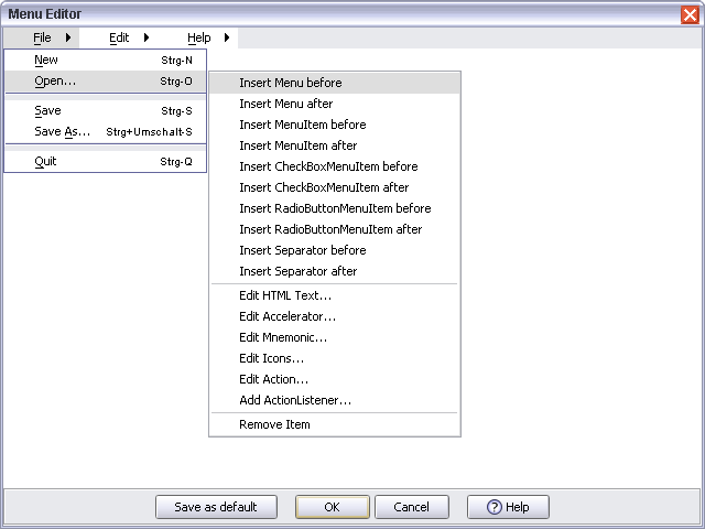
As you insert a
JMenuBar into a layout grid, the menubar is populated with some default menus. To change this default, you edit the menu hierarchy in the Menu Editor and click 'Save as default'.
|
| The Menu Editor |
JToolBar Top of page
JToolBar is traditionally added to an empty BorderLayout, so you can move the toolbar to the NORTH, EAST, WEST or SOUTH position (or drag it out of the container into its own window). The RADi runtime library will do this if
|
either there is no menubar and the toolbar is positioned in the first row of the design grid with no other components in that row or |
|
the menubar is in the first grid row and the toolbar is positioned in the second row with no other components in that row. |
The Top container
CardPanel
Folder Panel
Internal panels
Internal Frames and Palettes
JLayeredPane and JDesktopPane